


Listen to the article
The popular science communicator Hank Green published a YouTube video titled “A Masterclass in Manipulation,” responding to a Reason video I made about misleading climate charts. His video is better-than-average political discourse. He’s generous with the material, playing long uncut segments from my video instead of soundbites. He teaches his audience real things about how to read charts and spot a rhetorical sleight of hand, and along the way, he demonstrates something worth saying out loud: Two people can look at the same data and reach different conclusions without either of them being a fraud.
His video uses the same subtle manipulations he says I’m guilty of. I’m not attacking him by saying that. Anyone making an argument has a thumb on the scale, and the only durable defense is for viewers to learn to spot it. He both makes some good points and mischaracterizes my arguments at various points, which I’ll take up in turn.
First, I want to dispute his overall framing. Green characterizes me as the rear guard of climate denial: first claiming warming wasn’t real, then claiming humans weren’t the cause, and now fighting the last-ditch battle of “it’s not worth doing anything about.” I’ve been writing on climate for decades, and my position hasn’t changed: warming is real, humans contribute substantially, it matters, and the responses we choose matter at least as much as the diagnosis.
Treating any criticism of climate alarmism as do-nothing-ism is itself a rhetorical move, and it’s what I most want to push back on. Reducing the human environmental footprint is a 100-year project across many fronts—water, soil, biodiversity, materials, air, climate, all entangled. The single most consequential thing that has happened on that project in my lifetime is that the U.S. now produces a dollar of real gross domestic product (GDP) using roughly 60 percent less energy than it did in 1965, and that ratio is still falling. It is the largest single reason emissions per unit of output have decoupled from growth. It happened because engineers, investors, and operators spent careers building things that people adopted voluntarily.
Meanwhile, the activist wing of the climate movement has spent the same 50 years absorbing government money, proposing expensive coercive solutions, and attacking those who disagree with them. They get most of the airtime.
On to the charts. Green agrees with my characterization of one of the three I analyzed, conceding that it “isn’t a very good graph.” But he accuses me of cherry picking: “I went to the guy’s Substack who published it. No one’s seen it. It had like 25 likes. We are focusing on nothing.”
The author of that chart is Zeke Hausfather, a prominent climate scientist. I focused on it because it was the centerpiece of a Bloomberg column titled “A Chart Climate Denialists Can’t Ignore.” That column, which I open the video by quoting, uses the alarmist framing that my video is about. Green, at one point in his video, acknowledges the Bloomberg column and then reverts to the “25 likes on a Substack” claim. (I’m actually a Bloomberg Opinion columnist, pushing back on a column written by a colleague.) If the chart hadn’t been written up by a major opinion outlet under that headline, I wouldn’t have included it.
The next chart I criticized is from the Global Climate Change Research Program, titled “Record Warm Daily Temperatures Are Occurring More Often.” It presents record hot and cold daily temperatures as a ratio. I argued in the video that “the only reason to present the data as a ratio is to create a scary visual in which the alarming-looking red lines get taller and taller.” Green defends the ratio, echoing a point Steven Koonin makes in his book Unsettled: Because the underlying counts of records aren’t comparable from year to year (there are more weather stations now, and records become harder to set as the period of observation lengthens), some adjustment is needed for the chart to mean anything.
The need for an adjustment is real. The choice of a ratio as the adjustment is what manufactures the hockey stick, and it does so in two specific ways worth spelling out. First, the chart claims to show that record warm days are occurring more often. The actual count of record warm days is up modestly—a mild uptick, well within the range of past upticks and downticks in the series, no dramatic change in behavior, no large jump. Second, the count of record cold days has fallen close to zero. When you divide a moderate number that isn’t changing much by a small, rapidly shrinking number, the ratio explodes upward. That’s arithmetic, not climate. The same arithmetic also means that in years when record cold days outnumbered record warm days, the chart shows tall blue bars, which are visually large enough to trick the eye into seeing hockey sticks.
Koonin handled the same comparability problem properly. He normalized the underlying series for the number of stations and the length of the observation period, so the two series can be read on an apples-to-apples basis. When you do that, you see no hockey stick in the heat-record series, and a kind of inverted hockey stick in the cold-record series, with record cold days occurring less often. That is the honest way to communicate the same data, to educate rather than to alarm.
For serious climate analysis, the disappearance of record cold days is at least as strong a fingerprint of warming as a rise in record hot days, arguably stronger. The chart makers chose the ratio fix. Then they mislabeled the chart to claim it showed something it didn’t.
Green objects that I treat decreasing cold days as if they were good news, and he caricatures my position as oblivious to the consequences: “The entire Western United States is about to catch on fire!” In fact, I don’t treat them as good news; in the video, I call the trend an “unambiguous warning of potential future problems.”
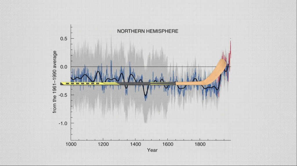
The third chart I criticized is Michael Mann’s 1998 hockey stick chart itself. Green elides over its well-documented problems. Mann reconstructed 1,000 years of Northern Hemisphere temperatures from tree rings and other proxies and then spliced the modern instrumental temperature record onto the end. In 2003, Stephen McIntyre and Ross McKitrick showed that Mann’s non-standard implementation of principal component analysis would generate a hockey stick shape even when fed random noise, and that his reconstruction depended heavily on a small number of bristlecone pine series that specialists had long flagged as unreliable temperature proxies. A 2006 National Research Council panel reviewed the work and conceded the statistical criticisms while defending the broad conclusion. A separate panel of statisticians chaired by Edward Wegman found the McIntyre and McKitrick critiques “valid and compelling.”
There is a further problem with the chart that deserves more attention. The dramatic visual—the blade of the stick—is not made of the same kind of data as the handle. The handle is a smoothed reconstruction built from proxies like individual tree rings, sampled decades apart, and run through a model that, by construction, cannot reproduce the month-to-month and year-to-year variation observed in real climate. The blade is the modern instrumental record, with all its actual variation intact.
Mann amplified that contrast visually: He rendered the blade in thick red, against the smoothed proxy series shown as a faint gray ribbon with shaded uncertainty regions. The blade is the visual focus of the chart; the handle might as well be wallpaper. What makes the chart look like a hockey stick is partly the temperature trend, but it is also the change in data type at the splice and the design choices that emphasize the modern blade over the smoothed past. None of this means warming isn’t real or that humans aren’t the cause. There are two good charts here, but pasting one on top of the other has no scientific justification. That’s what makes it alarmism, not science.
Green then claims I undercut myself by ending my video with a chart that is “literally the hockey stick graph”: the global mean temperature anomaly since 1880, with a simple trend line through it. It isn’t the same chart, and the difference is exactly the one I just described. Mann’s 1998 chart spliced proxy data onto instrumental data over a 1,000-year window, and most of the methodological controversy was about how the proxy portion was processed and how the splice was visually emphasized. The chart I show at the end uses only the instrumental temperature record, which is essentially the same data that forms Mann’s blade. On its own, without the smoothed proxy handle behind it and without the red-against-gray styling, that data shows a gently increasing trend, consistent with what every honest reconstruction shows. A chart that has an upward slope at the right edge isn’t “the hockey stick.”
My objection has never been to charts that show warming. My objection is to charts that exaggerate warming through statistical construction and design choices.
Green also takes me to task for characterizing Koonin as a “theoretical physicist” and Michael Mann as a “climate activist.” Both labels are accurate. I think Mann’s recent output is mostly advocacy and Koonin’s is mostly science, and those labels reflect my honest view.
That is part of what the video is doing. Green could just as easily have called Koonin a former B.P. chief scientist and Mann a working climate scientist, and both of those would also be true. Viewers should notice these choices and weigh the argument accordingly.
Green does the same thing himself, more than once. He smears Reason as a mouthpiece for billionaires rather than focusing on the quality of our journalism. He picks the framing that does the work he wants. That isn’t a flaw in his video; it’s the nature of the form. He is right to flag the move when I make it, and I am right to flag it when he does.
Watch his video. Watch mine. Notice where each of us picks a label. Notice where each of us picks which chart to show and which to leave out. Notice where each of us tells you what to feel before showing you the data. That is the only kind of media literacy that travels. If Green’s video makes more people do that, he’s done his job.
Read the full article here
Fact Checker
Verify the accuracy of this article using AI-powered analysis and real-time sources.